Howdy, folks!
We've been hard at work doing some upgrades to the Elaztek website! What started as a theme refresh gradually ended up evolving into a collection of fairly significant updates - so if you're interested to hear about what's new, keep on reading.
Our New Logo
You may not have noticed, but don't worry - that's on purpose.
We somewhat recently received some feedback about our logo being a bit... difficult to read. Those unfamiliar with it would read it as "Egaztev", or "Egaztek", or were even unsure if the Z was a letter or just some fancy design stuff, leaving the name to be "Egatek". You may not have had this issue - however odds are, you're already probably familiar enough with us.
Regardless, we felt it a worthy enough issue to address - however we weren't gonna just scrap the old logo. After all - our logo actually has been basically the same design from day one, with incremental evolutions and tweaks over the years. And this one is no exception. For convenience, here's a direct comparison of the two logos - with the previous being on top, and the new one below:
![]()
![]()
First, the Es both have some additional detailing to make them a bit more obviously Es. The little serif at the end of the L has been shortened, and the line connecting the L and A was removed. A small serif was actually added to the A on the right side, just to make it look a bit more A-like. From there, the lines extruding from the Z that went above/below the other letters was split a bit, to help make it more clear that the Z is in fact a Z. Lastly, the "STUDIOS" subtitle was shifted over a bit to account for that new gap.
And... that's pretty much it. All the letters have the same spacing, the footprint/size is identical, and the general design itself is basically unchanged. It's some subtle changes, but we think it's a good balance between the original design, while ensuring that it's not difficult for newcomers to read.
We've been gradually rolling the new logo out across our different websites, and with its introduction here on the website, that job is pretty much done. We hope you like it! If not, though - you can still relive the old days by switching back to Midnight 7.2 or an older theme. Oh yeah, speaking of themes...
Midnight 7.3
One of the goals of this new theme update was to help add a bit of differentiation from the earlier iterations of the style - or more accurately, the design that the very first Midnight 7 theme was based on.
If you've been around the block in terms of Halo fan projects, you've likely heard of Installation 01. If not, go check them out! In either case, you might notice some similarities between our site and theirs, in terms of the general look and feel of things. The homepage in particular is likely the most obvious example in terms of page layout, but the entire style was largely based on their site's design - which itself, was virtually a carbon copy of the Bungie.net website at the time.
We opted for this design since, in some sense, we do sort of want to evoke that general look and feel. Additionally, back then, we had the vague goal of being a sort of Bungie 2.0 - and you can still find little easter eggs, secrets, and a number of other things that pay homage to Bungie, especially old-school Bungie. And while that general vision isn't too different today, we do believe that we can and should do a bit more to differentiate ourselves. Not just for legal reasons, but just because we have to have some sort of unique identity of our own if we want to stick around long-term. Installation 01's website leans heavily into this, since they're focused exclusively on their Halo project - however, for us, we've got broader goals - and while Halo will likely always be an influence on who we are and what we do, it's not the only thing we want to do.
Gradually, we've taken steps to do this over the years - the homepage was redesigned to its current iteration, the about section was redesigned once before, and today, we take another small step towards that - with Midnight 7.3.
This isn't a super-significant redesign - instead, it's all about details. We feel it's a better blend of the old look - while still giving it a bit of a visual refresh that makes things not feel quite so much like a knockoff Bungie website. Some of the changes you can expect to find throughout the theme include, but are not limited to:
- More glowing effects - Because why not?
- Redesigned Accent Color Picker - The accent color picker no longer looks like it was ripped straight out of 2010, but don't worry - it behaves just as it did before
- Better Scrollbars - The resize grip now has an icon indicating as such, and scrollbars now have their arrows
- Improved Navigation Menu - The navigation menu now properly resizes for different screen resolutions. If there's not enough space on the navigation bar to fit everything, then any excess items will be placed into a "More" submenu. This fix was also backported to Midnight 7.2 as well
- Altered Form Fields - Form fields now display a bit nicer, with the description (if present) displaying on top of the field input, just under the title - rather than below the field input itself
- Better Reaction Menu - The mini reaction menu (used on the Status Updates block on the forums page) has been redesigned to be a grid, rather than a long row of reactions (which happened to be cut off entirely in some cases)
- New Font - The previous font we used, Montserrat, was something we borrowed from Installation 01. However, as time went on, we felt it wasn't the most readable in a lot of cases. As such, we've introduced a new font for most text - Nunito Sans. The old Montserrat font isn't gone though - it's doing the job we feel it does great this time: being a good heading/title font
- Revamped Daylight Theme - In previous versions of our theme, we offered a light mode option (named Daylight). However, while this worked fine, it resulted in a fair bit of duplicate work having to be done for the theme - and for users, wasn't as snappy as the more favorable light/dark mode button. As such - we've made it so that you can switch between Midnight and Daylight with a single button - and no need for reloading the page. You can find this button both on the bottom of the page right next to the Theme button, and you can also find it in the Customize Theme menu in the user bar
- A variety of other minor visual enhancements and bugfixes
As per usual - if the new theme isn't your cup of tea, you're more than welcome to revert back to Midnight 7.2 - or any of our other previous themes - by using the Theme button near the bottom-left of page.
About Section
Next, let's go over the updates to our About section.
If you recall our previous section, it was decent enough - but it was a bit of a pain to work with, and was also fairly barebones. There was a decent bit of information that we wanted to make easily available, that just wasn't gonna fit. Additionally, the entire thing was 100% manual HTML - no easy editors or anything.
However, with the recent update to IPB 4.7.10, both Elaztek and Chaotic United's website were on the same version - which meant that, among other things, we could more easily transfer content between the two without having to fix a bunch of stuff first. And it just so happens that Chaotic United's very own About section recently got an overhaul - itself based on the one we used here at Elaztek - and so we figured it just made sense to bring that one over here.
And so, after some additions and changes, our About section has been fully updated. Additionally, a good bit of content was rewritten entirely - such as the initial About page and the "Our Vision" page. There's also plenty of new stuff, too - such as the Story and Timeline pages. It's also got details of the logo history for both Elaztek itself as well as the various projects we own - overall, a ton of new goodies if you're interested in learning more about us and/or our history.
Helpcenter
Similar to the About section, our Helpcenter was similarly given the CU treatment - though in this case it's a lot less significant. The main change is that the Helpcenter's homepage no longer just dumps a bunch of recent pages on you, but instead presents you with a clear list of categories - as well as quick links to both our suggestions tracker and bug tracker if you feel like there's something we should cover in there, or if you happen to head there dealing with a bug. Just below all that, though, you'll still find the list of recent articles - just displayed in a grid instead of a big list.
If the new design isn't your cup of tea, though, we've included a handy dandy button to let you go back to the old design. Simply hit the "Switch to Classic View" button and you'll be presented with the helpcenter as it looked before.
Additionally, the category structure has been updated as well, similarly based on the one found on CU. You'll also notice that a lot of the old articles are no longer present - as many of them are in desperate need of being rewritten, as they were written many years ago and are at this point either out of date, or in some cases, were never even finished.
Job Portal
Another big change is the complete rethinking of how we handle staff applications. Thus far, we've largely been using the same system as Chaotic United - a single Staff Application form that you can fill out, and that's it. And over in CU, this works pretty well.
However, here at Elaztek, we felt we needed to do a bit more. Not just for our volunteer staff, but for future paid employees, once we end up making that transition down the line. We also took a good hard look at the old Staff Application format, and decided that, if we're being honest - it's quite a lengthy application. Too long, in fact. There's also zero indication as to what it is we're actually looking for - no information in terms of positions, requirements, expectations, or anything.
Today, however, that all changes with the introduction of our Job Portal. It's got a full list of what positions we're currently looking for, and each position details what it is we expect and are looking for. Along with this, we've introduced revised Team Guidelines and Team Member Expectations documents that you'll want to read over and agree to if you're looking to join us. The Team Guidelines outlines specifics on how our games are to be made, and how team members are expected to act and behave, and how they are expected interact with the community. The Team Member Expectations outlines general expectations for volunteer team members - in terms of time and work investments made as part of the team.
Another thing we've done is loosened the described requirements for each of our positions. While our requirements have generally been on the looser side for a while, this was not communicated very well - in fact, the opposite was communicated, with the big banner at the top of the Staff Application form instructing those applying that they must meet these really high requirements. Thing is, we just aren't in a position to demand super high skillsets - and beyond that, we believe in giving people chances now and again who might otherwise be ignored by employers. We of course aren't an employer at this stage - but the idea is that down the line, we'll be able to do so, once we get some real revenue coming in.
Along with those changes, however, you can also actually track the status of your application directly. Before, you just sent in an application and just hoped to maybe hear back. Now, however you've got a proper page showing both your active and previous applications directly. Even previous applications submitted through the old system have been migrated forward for your reference.
We've also designed the system to be transparent - with jobs being able to be given star ratings as well as reviews (though we'll remove reviews if they aren't from someone who's been in a position). Additionally, once we transition to become an actual honest-to-goodness employer, you'll see pay rates (either hourly or yearly) directly in the job list. Right now, everything will display as "Volunteer" - but we hope to change that down the line. We believe being straight and upfront with things like pay and job ratings are important - and for myself personally, I've always hated when jobs simply refuse to list the pay - and so I have to sit and wonder if I should even bother applying at all. As such, ours is designed to be as transparent and fair to candidates as possible - both for those applying today, and for those looking for real employment down the line.
And so, going forward, if you'd like to join the team, be sure to visit the Job Portal and see if anything interests you.
Ranking System
The last major change is the revamped ranking system.
The website has actually had a ranking system this entire time - it just didn't go up at all, and was never really communicated to the user or highlighted whatsoever. But once again, this all changes today.
Our previous ranking system only had 3 ranks - Newbie, Member (earned with 10 points), and Advanced Member (earned with 30 points) - and that's it. Now, however, we've got a whole collection of ranks, each being loosely military themed - and designed to loosely echo a certain video game series. You know the one.
Points can be earned by both creating content and receiving positive reactions on your own content. You can track your progress by opening the user menu (found by clicking your profile photo in the top-right of the page). At the top, you'll see something like this:
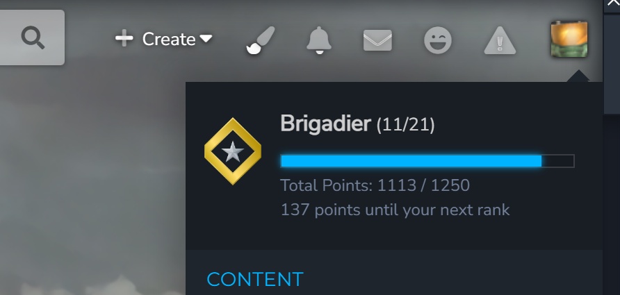
You can see your current rank, how far up the ladder you are, your total points, and the number of points you need to rank up again. You can also view another user's rank by visiting their profile, where it is now featured a bit more prominently. Additionally, the badge is no longer displayed next to the member title further down - since it didn't really fit in anyways.
In terms of the new ranks themselves, most of them are brand new - with the highest current rank being 7,777 points (because of course). The previous ranks technically still exist, too - just renamed and with a new badge. Newbie has become Recruit, Member has become Private, and Advanced Member has become Corporal - each with the same requirements as before. Users who already meet the requirements for any rank beyond Corporal should have had their rank automatically updated - but if that didn't happen for you for some reason, do let us know and we'll get it sorted out for you!
If you're interested in the full list of ranks, be sure to check the page below - and to see what all the pretty new badges look like!
Wrapping Up
Whew - that was quite a bit to go through! Seems like virtually every one of these I write ends up being a whole essay and a half.
Regardless - if you've got any questions or comments, be sure to drop them below, or speak up in our Discord server! We've got a pretty big announcement coming within a few days or so (no, it's not Blamite related) that we've been itching to tell you. As such - be sure to keep an eye both here and on our Discord server for when we announce that.
And of course, no announcement would be complete without the obligatory "if you'd like to help us work on Blamite, be sure to apply below" part - so here's that. If you're interested, go do that - at the brand new Job Portal!
Recommended Comments
There are no comments to display.
Create an account or sign in to comment
You need to be a member in order to leave a comment
Create an account
Sign up for a new account in our community. It's easy!
Register a new accountSign in
Already have an account? Sign in here.
Sign In Now